


Administrative Dashboard
The Administrative Dashboard gathers your institution’s main numbers: how many people are registered, how many actually use the platform, how completions are going, performance in evaluations and which contents engage the most. It is the management view that answers “how are we doing?” without having to build spreadsheets.
Everything is calculated live from your own institution’s data - no other customer appears here.
How to enable the dashboard
Section titled “How to enable the dashboard”The Administrative Dashboard is released per institution, and the release is done by the Eduvem team (it is a platform setting, not an option the institution administrator turns on by themselves). If your institution does not have the Dashboard yet, contact Eduvem support to enable it.
Once enabled, when entering the admin console the institution administrator lands straight on the Dashboard: it becomes the administrator’s home screen, in place of the default administration screen. The other administration areas (Classes, Contents, Participants, institution settings) remain accessible through the console’s normal navigation - and, as you will see next, the Dashboard’s own reports are now part of that same navigation.
Where to find each report
Section titled “Where to find each report”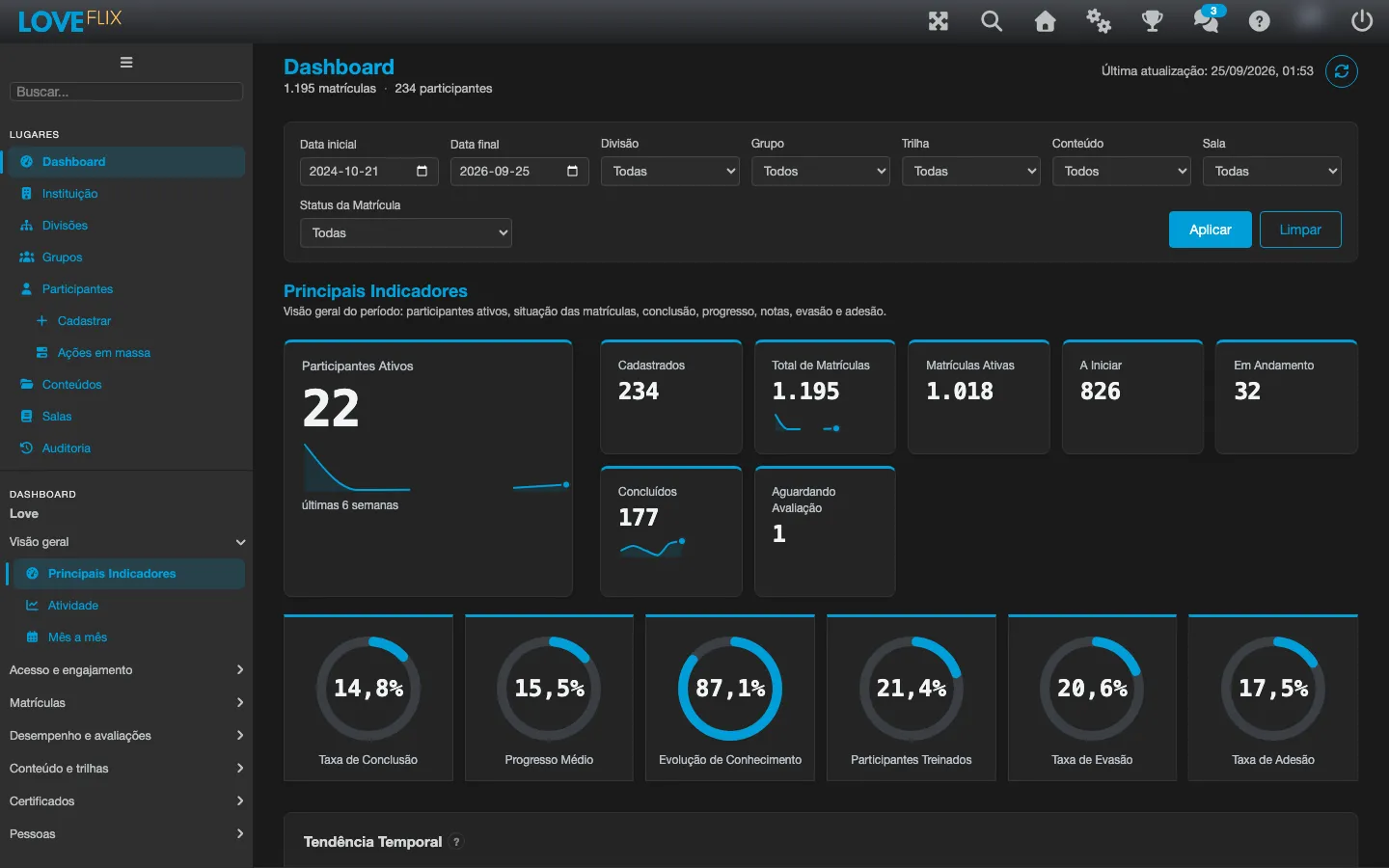
The Dashboard’s reports appear as items in the administration side menu, grouped under the Dashboard item, alongside the other areas (Classes, Contents, Participants, etc.) - instead of loose tabs inside the Dashboard screen. There are twenty-six reports, organized into seven blocks:
| Block | Report | What it shows |
|---|---|---|
| Overview | Key Metrics | The summary at the top: registered, total enrollments, active enrollments, not started, completed, in progress, trained participants and awaiting evaluation, plus indicators such as active users, completion rate, average progress, dropout rate and adherence rate, with a trend chart over the weeks. |
| Overview | Activity | How many participants logged in and how many certificates were issued on each day of the last 12 months, across the whole institution - see Activity: access and certification map below. |
| Overview | Month by Month | Active participants and certifications for each of the last 12 months, compared with the median of the earlier months - see Month by month: the last month against the typical month below. |
| Access and engagement | Engagement | Who is actually using the platform: completion ranking per Class, an activity map by day of the week and the list of below-average contents. |
| Access and engagement | Team Compare | Members, completion, average progress and logins in the last 7 days for each Team, with the certificates issued over the last 12 weeks and the median across all teams - see Team Compare: how each team is doing below. |
| Access and engagement | Retention by Entry Week | How many participants from each entry week come back, week after week - see Retention by Entry Week: who keeps coming back below. |
| Enrollments | Enrollment flow | The path enrollments take from one status to another - see Enrollment flow: the path from enrollment to completion below. |
| Enrollments | Progress per class | A progress comparison across Classes, with one click to filter the whole dashboard by one of them - see Progress per class: comparing progress across Classes below. |
| Enrollments | Days to Complete | How many days participants took from first access to certification, per Class - see Days to Complete: how many days until certification below. |
| Enrollments | Weekly Lifecycle | Enrollment transitions per week, over the last 52 weeks - see Weekly Lifecycle: enrollment transitions by week below. |
| Performance and assessments | Performance | Performance in evaluations: average score, learning effectiveness index, performance by topic and where participants give up along the journey. |
| Performance and assessments | Learning gain | The evolution of knowledge before and after the Content, per Content - see Learning gain: before and after the content below. |
| Performance and assessments | Exam Scores | The score distribution per Class and exam and the list of attempts - see Exam Scores: how the exams went below. |
| Performance and assessments | Classes Compared | Each Class of a Content compared with the typical Class of that Content - see Classes and Content compared: who is above or below typical below. |
| Performance and assessments | Content Compared | Each Content in the institution compared with the typical Content - see Classes and Content compared: who is above or below typical below. |
| Content and tracks | Content | How each Content performs, with charts and the view by Learning Tracks (grouped by category). |
| Content and tracks | Track Funnel | How many participants reach and complete each step of the Learning Tracks - see Track Funnel: how far participants get at each step below. |
| Content and tracks | Lecture Dropout | How far enrollments in a Wizard Content get, lecture by lecture - see Lecture Dropout: how far participants get through the content below. |
| Content and tracks | Question Difficulty | The share of correct answers per final-exam question, and which wrong options trip participants up the most - see Question Difficulty: what trips participants up in the exam below. |
| Certificates | Expirations | The enrollments with no certificate yet whose access deadline is running out - see Expirations: access deadlines running out below. |
| Certificates | Compliance Matrix | Who is up to date on mandatory content, participant by participant - see Compliance Matrix: who is up to date on mandatory content below. |
| Certificates | Content Health | Per content: certificates about to expire, participants with no certificate on a successor version, and whether the content is still in use - see Content health. Only shows up with certificate validity enabled. |
| People | Participants | The list of people, with search, to look up and export. |
| People | At risk | The ranking of enrollments most likely to drop out - see At risk: who is most likely to drop out below. |
| People | Ratings & NPS | The NPS per Class from participants’ ratings - see Ratings & NPS: what participants think of the content below. Only shows with the rating survey enabled. |
| People | Learner Timeline | The event history of one specific participant, newest first - see Learner Timeline: one participant’s history below. |
Clicking a report swaps the content instantly, without reloading the page - the filters you applied keep applying when you switch reports. Each report also has its own address in the browser bar, so you can bookmark it or share the link to a specific report with someone else on your team.
All the numbers respect the platform’s terminology: Class (the offering of a Content), Enrollment (a person’s link to a Class), Content (the learning material) and Participant (the person who learns).
Activity: access and certification map
Section titled “Activity: access and certification map”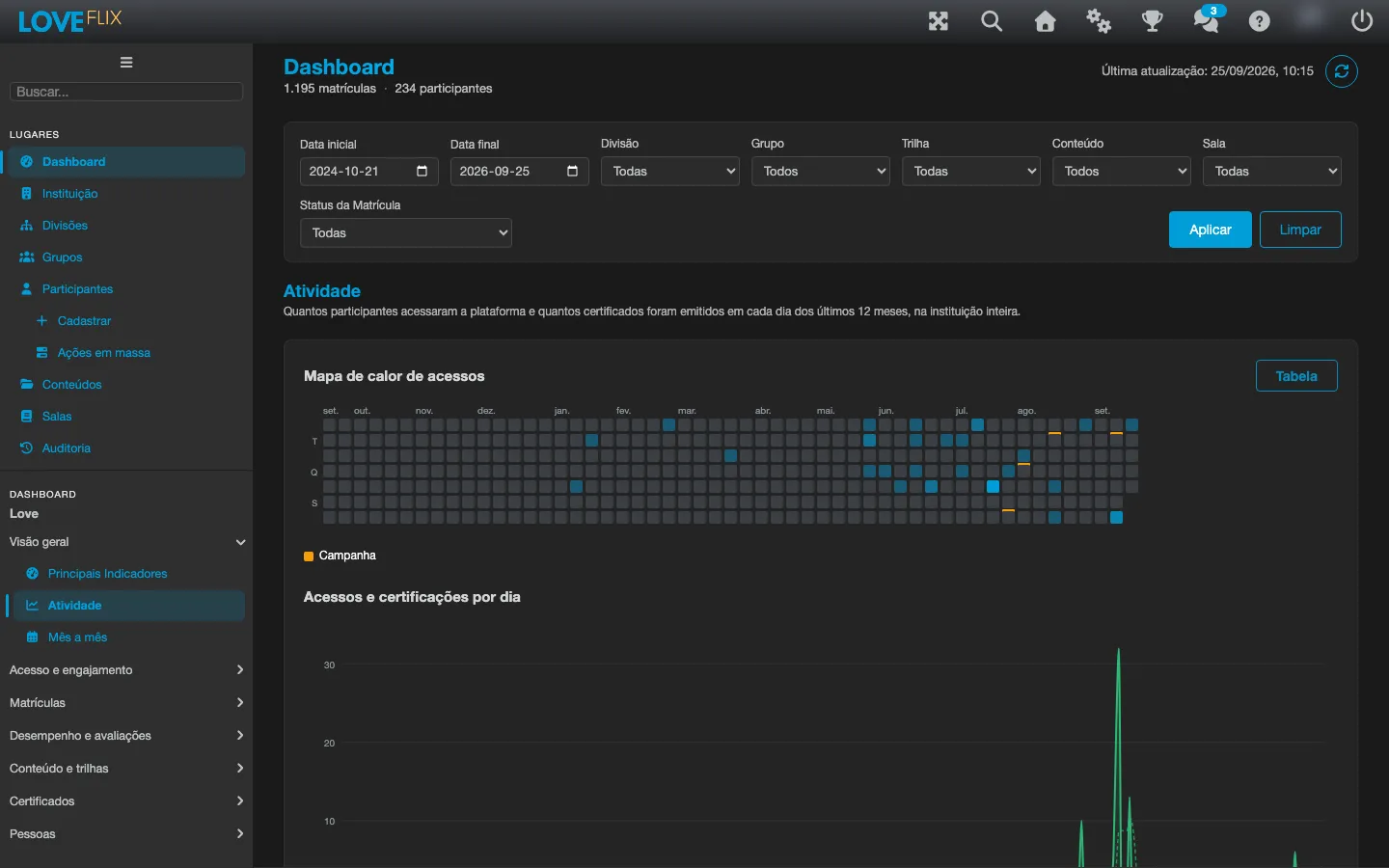
The Activity report is the new addition in this version. It always covers the last 12 months across the whole institution - the date range and the other filters in the bar do not apply to it, and a notice says so whenever a filter is in use. It shows two charts, one below the other:
- Access heatmap - a calendar where each square is a day, and the darker (more intense) it is, the more people accessed the platform that day. Hover over a square to see the date and the exact numbers of accesses and certifications for that day.
- Daily accesses and certifications - a line chart with each day’s accesses and certifications, plus a dotted 7-day moving average line for each series, which helps you see the trend without the noise of day-to-day variation.
The days on which the institution sent a notification to participants appear marked on both charts (a small mark under the heatmap square). Hover over the mark to see a summary of the notification and how many people received it. To manage those notifications, see Notifications to participants.
The Table button, at the top of the report, swaps the two charts for an accessible table with the same data: Day, Accesses, Certifications and the notification sent that day (when there is one). Click again to go back to the charts.
Enrollment flow: the path from enrollment to completion
Section titled “Enrollment flow: the path from enrollment to completion”The Enrollment flow report shows, in a diagram, how enrollments move between the statuses of the journey (for example, from “Enrolled” to “Completed”, or to “Cancelled”) within the selected scope. Each link in the diagram represents a transition and the number of enrollments that went through it.
Unlike the other Dashboard reports, this one is calculated once a day, not on every opening. Right after the institution is enabled, it may show as “calculating” for about 15 minutes until the first calculation finishes, and the history fills in gradually over the following runs (about 30 days of history per run), instead of appearing complete all at once.
The Content, Class and Track filters apply to this report; the Division, Group and Enrollment Status ones do not - see Filtering the data below.
Progress per class: comparing progress across Classes
Section titled “Progress per class: comparing progress across Classes”The Progress per class report shows, in stacked bars, how many enrollments in each Class are in each progress band (not started, up to 25%, 25% to 49%, and so on, up to completed). It is the fastest way to compare progress across Classes of the same Content or of different Contents.
Clicking a bar filters the whole dashboard by that Class - an indicator with the Class name appears showing the active filter. To remove the filter, use the indicator itself or the Clear button on the filter bar.
This report shows the current state of each Class, and only the Content filter applies to it: Date, Track, Division, Group and Enrollment Status do not - a notice appears when any of them is in use. The Class chosen in the Class filter is highlighted among the others instead of hiding them.
Learning gain: before and after the content
Section titled “Learning gain: before and after the content”The Learning gain report compares the average evaluation score before and after each Content, per Content, together with the sample size (how many enrollments went into the calculation). It is a way to see how much knowledge each Content actually adds, beyond just knowing whether participants completed it.
Expirations: access deadlines running out
Section titled “Expirations: access deadlines running out”The Expirations report shows a 120-day timeline (30 days back and 90 days ahead) with the enrollments that have no certificate yet and whose access deadline has already passed or is about to, plus a list of the 200 closest to their deadline. Use it to act before the deadline passes with the content unfinished.
What runs out here is the enrollment’s access deadline, not the validity of a certificate already issued - for certificate validity, see the Compliance Matrix.
At risk: who is most likely to drop out
Section titled “At risk: who is most likely to drop out”The At risk report is a paginated table (50 participants per page) with the enrollments most likely to drop out, sorted by risk. Each row carries one or more of the following reasons:
- Never accessed the platform, more than 7 days after enrolling.
- No progress for more than 14 days, with the content still unfinished.
- Access deadline within 14 days (or already past) with less than 75% progress.
Clicking a participant’s name takes you straight to the Participants report, already filtered to that person.
Days to Complete: how many days until certification
Section titled “Days to Complete: how many days until certification”The Days to Complete report shows, for each Class, how many days participants took from their first access to certification. Each Class is one row: the dots are the certifications spread along the days axis, the darker band marks the middle half of participants and the vertical tick is the Median. Hover a cluster of dots to see the day range and how many certifications fell in it, and hover the tick to see the median. If the Class has a deadline configured (days to complete), a dashed Deadline marker appears at that position - so you can see at a glance who certified within it.
Certified enrollments with no recorded first access are left out of the calculation; the table shows how many under Excluded (no first access recorded). When there are more than 24 Classes with certifications, the report shows the 24 largest and says so - filter by Class to see the others. Days are counted in the institution’s time zone.
Exam Scores: how the exams went
Section titled “Exam Scores: how the exams went”The Exam Scores report has two parts. Score distribution shows, for each Class and exam, how many submitted attempts fell into each score band (0-10, 10-20 and so on, up to 90-100). The Attempts table below lists the attempts one by one - participant, Class, exam, Submitted on, score and Approved - 50 per page, with paging controls.
Some attempts carry badges: Over the time limit (submitted after the exam’s time ran out), Integrity alert (the platform recorded an alert during the exam) and Score recompute mismatch (the score sent by the browser differs from the one recomputed on the server). An attempt with no recorded score shows a blank score and is not counted in any band - it does not count as zero. Voided attempts appear neither in the distribution nor in the table. The report shows only score, approval, date and badges: the answers given in the exam do not appear here.
Ratings & NPS: what participants think of the content
Section titled “Ratings & NPS: what participants think of the content”At the end of a piece of content, the participant can answer, from 0 to 10, how likely they are to recommend it. The Ratings & NPS report turns those answers into an NPS per Class: Promoters (scores 9 and 10) to the right of zero, Detractors (0 to 6) to the left and Passives (7 and 8) as a marker in the middle. A legend identifies the Promoters, Passives and Detractors colors. Hover a bar to see the three counts, the total Responses and the Class’s NPS. Only Classes with at least one rating appear.
The Trend line shows the NPS month by month over the last 24 months, on a -100 to 100 axis with the zero line visible. Hover the line to see each month’s NPS; an isolated month, with no neighboring month holding data, appears as a dot. That trend is always institution-wide: the filter bar applies only to the per-Class bars, and the report says so while a filter is active.
This report is hidden from the menu when the institution’s rating survey is set to Disabled. It reappears with any other setting (Class decides, Optional or Mandatory) - even if the institution already has ratings from before the survey was disabled.
Compliance Matrix: who is up to date on mandatory content
Section titled “Compliance Matrix: who is up to date on mandatory content”For this report, a piece of content is mandatory when it has a certificate validity configured (more than zero days). The Compliance Matrix crosses participants with mandatory content: one column per content, one participant per row and, in each cell, the certificate status - Valid, Content updated (the content has a new version and the certificate needs a refresher - see Content version replacement), Expiring Soon (expires within the next 30 days), Expired, In progress (enrolled, not yet certified) or No certificate. When a participant has more than one enrollment in the same content, the best status wins. A legend shows the color of each status. Each column header carries the totals per status, and the rows are ordered worst to best (most expired certificates first), 50 per page.
The report only shows up in the menu for institutions with the Allow certificate validity option on; elsewhere, the item does not appear in the side menu. When there are more than 12 mandatory contents, the 12 highest-risk ones are shown - filter by Content to see the others. The Division and Group filters apply; the date, Enrollment Status, Class and Path filters do not, and the report says so when one of them is active.
The Table button on the Enrollment flow, Progress per class, Learning gain, Expirations, Days to Complete and Ratings & NPS reports works like the one on the Activity report: it swaps the chart for an accessible table with the same data, and another click goes back to the chart. The At risk report is already a table, so it has no such button.
Team Compare: how each team is doing
Section titled “Team Compare: how each team is doing”The Team Compare report shows a mini-chart per Team with the number of certifications issued each week over the last 12 weeks (the most recent week’s number appears next to the team name), together with a dashed line marking the median number of certificates across all teams - so you can see at a glance which teams are above or below the institution’s average. A note next to the chart explains what the mini-charts count, and hovering a team shows how many certificates it issued in the last week and the median across teams. The Table button shows, for each team, the number of Members, the Completion rate, the Average progress and how many members were active in the last 7 days. This report does not list individual participants.
When there are more than 24 teams with enrollments, the report shows the 24 largest by member count - filter by Team to focus on one of them.
The filter bar decides which teams appear and applies to the table’s Members, Completion and Average progress columns. The certification mini-charts and the Active (7 days) column always cover each team’s whole activity - so whenever any filter is in use, a notice appears next to the chart.
Retention by Entry Week: who keeps coming back
Section titled “Retention by Entry Week: who keeps coming back”Retention by Entry Week groups participants by the week they entered the platform - the week of their first enrollment - and shows, for each of those weeks, how many came back in the following weeks. Each row is an entry week (labelled with the Monday that starts it, in the institution’s time zone), the Entered column gives how many people entered that week, and the remaining columns are the weeks counted from it: Week 1, Week 2, and so on.
It always covers the 12 most recent complete weeks. The current week is deliberately left out: it has not finished yet, so it would show artificially low numbers and look like a sharp drop in retention.
The filter bar’s date range does not apply to this report: the same 12 weeks are shown, regardless of the chosen interval. Of the other filters, only Division and Group apply; Track, Content, Class and Enrollment Status do not. When a filter that does not apply is in use, a notice appears next to the chart.
If the institution has more than 20,000 participants in scope, the live calculation becomes too expensive, and the report asks you to filter by Division or Group before trying again, instead of trying to process everyone at once.
Weekly Lifecycle: enrollment transitions by week
Section titled “Weekly Lifecycle: enrollment transitions by week”The Weekly Lifecycle report shows, in a line chart - one colored line per status, identified in the legend -, how many enrollments moved into each status (for example, into “Completed” or “Cancelled”) each week, over the last 52 weeks. Weeks without any transition show as zero instead of dropping off the axis. Hover the chart to see the week and how many enrollments moved into each status that week. It uses the same precomputed data as the Enrollment flow report, so it inherits the same limitation: the history fills in gradually over the following runs, not all at once, right after the institution is enabled.
If the precomputed history does not yet cover all 52 requested weeks, the report shows a notice stating which date the data actually starts from.
The Content, Class and Track filters apply to this report; the Date, Division, Group and Enrollment Status ones do not. When a filter that does not apply is in use, a notice appears next to the chart.
Track Funnel: how far participants get at each step
Section titled “Track Funnel: how far participants get at each step”The Track Funnel report shows, for each Learning Track with enrollments, a funnel with one bar per step: how many participants reached that step and how many completed it, starting from everyone enrolled in the first step. Each track gets its own funnel, with that starting total in the header, and a legend tells the Reached and Completed bars apart.
Unlike the Compliance Matrix, this report counts every enrolled participant, without applying Team visibility - the idea is that an administrative completion report should not hide who is enrolled.
The chart draws up to the first 24 steps of each track; when there are more, a notice reads “and N more steps - see the table”. The table, reached through the Table button, always lists every step, with no limit.
The Division and Group filters apply to this report; the Date, Content, Class, Enrollment Status and Track ones do not - since the report is already organized by track, the Track filter does not apply to it. When a filter that does not apply is in use, a notice appears next to the chart.
Lecture Dropout: how far participants get through the content
Section titled “Lecture Dropout: how far participants get through the content”The Lecture Dropout report shows, for the Content chosen in the Content filter, a curve with the share of enrollments that reached each published lecture, in the order it appears in the current publishing. The first point is Started: whoever opened at least one lecture (whoever never opened any stays in the total enrollment count, as not started). Each following point counts whoever got to that lecture or beyond it - so the curve never goes up, and a lecture inserted later in the publishing never reads as a drop.
The Table button shows, lecture by lecture, two numbers: how many enrollments opened the lecture directly, and how many reached it or beyond (the same basis as the curve), with the percentage over total enrollments.
Two details of how the calculation works: a reset final exam (see Resetting an exam) wipes the participant’s lecture history, so they count again as never having started the content; and visits to lectures that are no longer in the current publishing (removed or replaced after the participant went through them) are disclosed separately, in a notice above the chart, instead of being added into the curve.
The report only exists for Wizard Content - SCORM and Coursebox do not record lecture-by-lecture access, and a notice appears in place of the chart. You need to pick a Content in the Content filter and click Apply before the report appears. Unlike most other Dashboard reports, every filter in the bar applies here: Date, Division, Group, Track, Content, Class and Enrollment Status.
Question Difficulty: what trips participants up in the exam
Section titled “Question Difficulty: what trips participants up in the exam”The Question Difficulty report shows, for each multiple-choice question of the final exam of the Content chosen in the Content filter, how many responses the server has graded and the share answered correctly, as horizontal bars - one bar per question. A question with no graded responses yet is labelled with no bar, instead of showing as 0% correct, so it does not read as the hardest question on the exam.
Under each question, a table lists the wrong options and how many times each one was picked by mistake; the correct option carries the answer key label and is never counted here. It is the most direct way to see which “trick option” confuses participants the most on each question.
Only server-graded responses count: from the current publishing of the exam, and from earlier publishings where the question had exactly the same options and the same answer key as today - changing an option or the answer key on a question resets its history in this report. Attempts from an exam voided by Resetting an exam do not count. When it applies, a notice shows how many responses were left out for coming from another publishing (with different options or answer key), and how many attempts have no server-graded response at all.
If the current publishing has no multiple-choice final exam, or there are no server-graded responses yet in the selected scope, the report shows a notice in place of the chart. Like Lecture Dropout, it only exists for Wizard Content, needs a Content picked in the filter to appear, and respects every filter in the bar.
Classes and Content compared: who is above or below typical
Section titled “Classes and Content compared: who is above or below typical”The Classes Compared report and the Content Compared report compare the institution with itself - no data from any other institution goes into the numbers. Classes Compared places each Class of the Content chosen in the Content filter next to the median of that Content’s Classes, that is, the typical Class. Content Compared does the same for each Content in the institution, compared with the typical Content.
The Metric selector chooses what to compare: Completed, Started, Pass rate (among evaluated) - which counts only those who already have an evaluation recorded - and Average score (scores > 0), which ignores zero scores. Each bar shows how many percentage points (p.p.) the Class or Content sits above or below the median, and the pooled rate appears as a second reference, adding all enrollments together. The Table button lists every row with its difference and sample size; when there are many, the chart shows only the ones furthest from the median, above and below, while the table still lists them all.
Two rules keep the comparison from misleading: Classes or Contents with fewer than 10 enrollments appear in grey, marked as a small sample, with no difference calculated and left out of the median; and with fewer than 3 Classes or Contents above that minimum there is no median - the bars show only each one’s own value.
Classes Compared requires picking a Content in the Content filter and clicking Apply. The Class chosen in the Class filter does not narrow the comparison: it only appears highlighted among the others. Content Compared ignores the Content and Class filters. The remaining filters (Date, Division, Group, Track and Enrollment Status) apply to both reports; when Division, Group, Track or Status is in use, a whole institution reference also appears, calculated without those filters, so you can compare the slice with the whole.
Month by month: the last month against the typical month
Section titled “Month by month: the last month against the typical month”The Month by Month report shows, for the whole institution, the active participants and the certifications of each month: the current month and the 12 before it. Active participants follow the same count as the control panel (see Where the “active users” number comes from below). The dashed line is the median of the complete months before the last complete month, and the report states how far the last complete month landed above or below it. The current month appears hatched, marked as month in progress, and is left out of the median.
With fewer than 3 complete months of data there is no median to compare against. A month earlier than the period covered by the activity history shows no data for certifications - the value is unknown, not zero - and is left out of the certifications median; that month’s active participants are still counted normally. The report uses none of the bar’s filters, and a notice appears when filters are in use.
Learner Timeline: one participant’s history
Section titled “Learner Timeline: one participant’s history”Unlike the other Dashboard reports, the Learner Timeline does not follow the filter bar - it has its own search box, where you enter the username of a participant of the institution and click Search (the participant’s internal identifier, the UUID, also works) (or use the Clear button to start over). If any filter in the bar is in use, a notice reminds you that they do not apply to this report.
Once the participant is found, the report shows that person’s events from newest to oldest, 50 per page: platform logins, enrollment status changes, content items accessed, exam attempts (with score and approval status) and certifications - each event with a plain-language description (for example, “Enrollment in [Class] moved from Enrolled to Completed”). The Table button swaps that list for a table with the same columns (When, Type, Class, From, To, Item, Score, Approved).
Satisfaction (NPS) ratings do not appear in this timeline. The report also does not show IP addresses, rating comments, or the answers given in exams - only score and approval status, same as the Exam Scores report.
Filtering the data
Section titled “Filtering the data”
A filter bar at the top lets you slice everything, in the order they appear on screen:
- Start date and End date - to look at just one interval (for example, last month).
- Division - to see the numbers of a specific division (available for institutions that use divisions).
- Group - to see the numbers of a specific group.
- Track - to see the numbers of a specific track from the home screen.
- Content - to focus on a specific material.
- Class - to see the numbers of a specific class.
- Enrollment Status - to slice by enrollment situation.
The filters are cumulative: combining them narrows the slice. Choose the values and click Apply to update the cards and charts. The Clear button removes all filters and returns the numbers to the institution’s total.
A partial exception: the Active Participants indicator follows the period (Start date and End date) like all the other cards, but is not affected by the Division, Content, Class and Status filters. The reason is technical, not a choice: the access record stores only who entered the platform and when, with no link to the content or class the person opened - so there is no information to slice that number by those fields.
Another exception: the Enrollment flow report respects the Date, Content, Class and Track filters, but not the Division, Group and Enrollment Status ones, and Progress per class respects only the Content filter. The reason is also technical: both are calculated at the Class level, without the detail needed to slice by person (and Progress per class shows only each Class’s current state, with no history by period) - the screen itself shows a warning when a filter that does not apply is active.
Exporting the Participants list
Section titled “Exporting the Participants list”In the Participants report, the Export CSV button downloads the list of people exactly as it is on screen - respecting the filter/search applied at the moment. The file (CSV format, which opens in any spreadsheet) has one row per participant.
Two useful details:
- The export has a ceiling of 10,000 rows. If your slice has more than that, the platform warns you and asks you to refine the filters before downloading - so the file never comes “cut off” without notice.
- Names starting with signs such as
=,+,-or@come out with a protection (a leading apostrophe) so the spreadsheet does not interpret them as a formula. It is a safety measure, not a data error.
Where the “active users” number comes from
Section titled “Where the “active users” number comes from”The dashboard’s Active Participants card uses exactly the same definition of “active user” as Eduvem’s billing calculation - it is not a number recalculated just for the Dashboard. To check, set the dashboard dates to whichever month you want and compare with the Institution Access Report for the same month: the two values are equal. To understand what counts as “active”, see What active users are.
A detail that often raises questions: the Current month and Previous month columns of Eduvem’s control panel use their own fixed windows, which do not follow the dates chosen here - which is why they can show a number different from the card. Always compare equal periods before concluding there is a discrepancy.
Why the first opening may take a few seconds
Section titled “Why the first opening may take a few seconds”For institutions with a lot of data, building all the indicators is a heavy calculation. So you are not kept waiting every time, the platform keeps the ready result for a while and serves it quickly on the next openings. Practical consequence:
- The first opening (or the first after a good while) may take a few seconds - it is the calculation being built.
- The following openings are almost instantaneous.
- The numbers reflect the institution’s recent state; it is not a “to-the-second” report, but a management view refreshed from time to time.
To force a refresh before that, use the Refresh button at the top of the dashboard: it recalculates the indicators and charts. To avoid overload, a second click within less than a minute is ignored - wait at least a minute between two manual refreshes.