Help button in the top menu
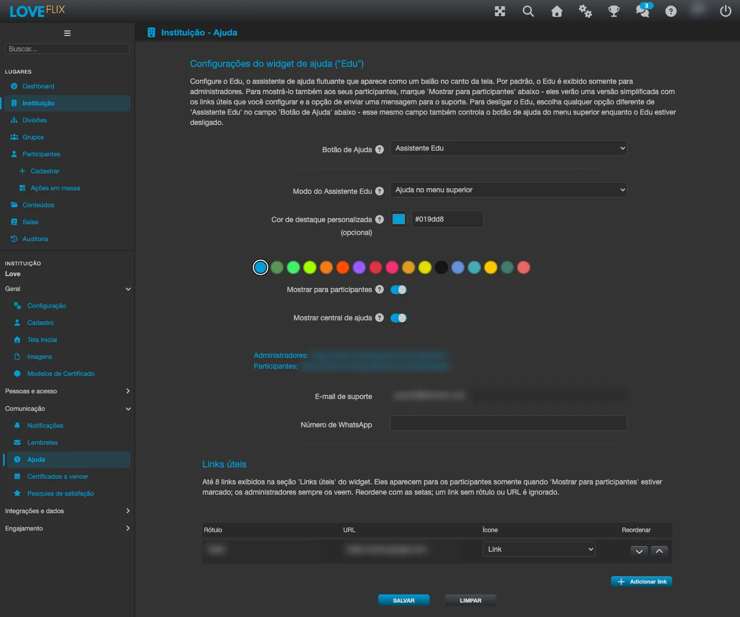
The platform offers help to the user in two ways, both controlled by the same Help type field, on the institution’s Help widget tab: a help button in the top menu or the Edu Assistant, a floating help balloon. The choice is made per institution.
The Help type modes
Section titled “The Help type modes”| Mode | What happens |
|---|---|
| Help Popup | The top-menu button opens the platform’s default help popup. |
| Hidden | The help button does not appear in the top menu. |
| Custom Page | The top-menu button opens, in a new tab, a help page owned by your institution. |
| Edu Assistant | Turns on Edu, the floating help assistant (a balloon in the corner of the screen), instead of the top-menu button. Edu’s options live on the Help widget tab - see the section below. |
| Support Chat (Zendesk / Movidesk) | The button opens the support chat of the provider your institution already uses. This option only appears in the list when a provider is configured - see the Support Chat section further down. |
The first three modes control the help button in the top menu. Choosing Edu Assistant replaces that button with Edu’s floating balloon: the two never appear at the same time.
Setting up a page of your own
Section titled “Setting up a page of your own”When you choose Custom Page, fill in the Custom help page URL: the address of your help center, FAQ or any page you want to offer the participant. The platform checks that the address is a valid URL before saving.
Use this mode when your institution already maintains its own help center (an internal FAQ, an HR support portal) and prefers to send the participant there instead of to the platform’s default help content.
Edu Assistant (the floating help balloon)
Section titled “Edu Assistant (the floating help balloon)”Edu is a help assistant that appears as a floating balloon in the corner of the screen. To turn it on, choose Edu Assistant in the Help type field and configure the rest on the Help widget tab of the institution settings.
By default, Edu is shown only to administrators. You decide how it appears and what it shows:
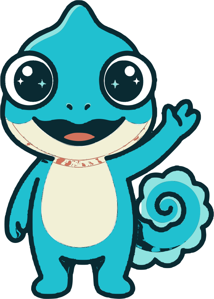
- Edu assistant mode - how Edu presents itself: Edu mascot (with the mascot), Floating help (a neutral balloon, without the mascot) or Help in the top menu.
- Show to participants - when checked, authenticated participants also see Edu, in a simplified version (the greeting, the useful links and the option to send a message to support). Unchecked, Edu stays administrator-only. A compact version also appears on the login screen, following the same mode chosen above (with the mascot in Edu mascot mode; as a floating balloon with a “?” in the other modes). On that screen it shows only the Help Center (when enabled), the contact email and the WhatsApp number - the useful links do not appear before login, since they are shortcuts meant for someone already inside the platform. If none of those three is configured, the login-screen version does not appear.
- Show help center - adds, for the participant, a link to the help center. Applies only when “Show to participants” is enabled.
- Useful links - up to 8 links (label, address and an icon) shown in Edu’s panel. Reorder them with the arrows; a row without a label or without an address is ignored. Administrators always see these links; participants only when “Show to participants” is checked.
- Greeting message - the text at the top of the panel when it opens. Left blank, the default greeting is used.
- Support email and WhatsApp number - the contact channels offered in the panel.
- Accent color override (optional) - a hexadecimal color (e.g.
#1a90c4) for the widget’s accent. Left blank, the institution’s theme color is used automatically.
Hiding the floating balloon (personal preference)
Section titled “Hiding the floating balloon (personal preference)”Each person who sees Edu (an administrator, or a participant when “Show to participants” is enabled) can hide the floating balloon just for themselves, without changing the institution’s configuration. At the bottom of Edu’s panel there is the option “Hide the floating button (open help from the top menu)”. When it is checked:
- the floating balloon disappears from that person’s screen;
- Edu remains reachable through the help button in the top menu.
It is an individual preference, saved per person and per institution - it does not affect what other administrators or participants see. To bring the balloon back, open Edu from the top menu and uncheck the same option.
This option does not appear when the Help type is already set to Help in the top menu (there is no balloon to hide in that case).
Support Chat (Zendesk / Movidesk)
Section titled “Support Chat (Zendesk / Movidesk)”If your institution already uses Zendesk or Movidesk, the help button can open the provider’s chat directly, instead of the platform’s help content.
The option only appears in the Help type list when the provider is actually configured: Zendesk enabled with the Zendesk Widget Key filled in, or Movidesk enabled with the Movidesk App ID filled in. Configure the integration first in Third-party widgets and only then choose this mode.
Three points that usually raise questions:
- The Help type field is what decides. Enabling the chat integration does not by itself change what the button does: for it to open the chat, choose this mode explicitly.
- With Zendesk and Movidesk both enabled, the button opens Zendesk. One button can only open one widget. Movidesk remains reachable through the contact line of the help panel itself.
- If the integration is later disabled (or the key is removed), the button goes back to opening the default message form, instead of stopping responding.